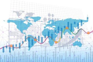
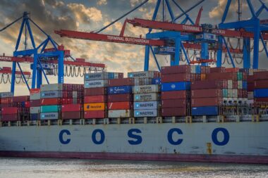
Trade Data Visualization Techniques for Better Insight
In today’s globalized economy, understanding trade data is essential for informed decision-making. With the vast amount of information generated from international trade, visualization techniques become crucial. Effective visualization helps analysts grasp trends, patterns, and anomalies within trade statistics. Data can be represented in various formats, enabling stakeholders to easily interpret and act on the information provided. Graphical representations such as charts, graphs, and maps simplify complex datasets, making it easier for non-experts to understand. For example, line charts can track trade volume over time, while bar graphs can compare the import and export levels of various countries. Additionally, geographical maps can illustrate trade routes and volumes visually, highlighting key trading partners. Ultimately, these tools not only enhance clarity but also foster collaboration among stakeholders. By utilizing interactive dashboards, businesses can monitor trade metrics in real time. This approach promotes data-driven decision-making. Hence, adopting user-friendly visual tools is vital for enhancing trade analysis efficiency and accuracy. The right visualization techniques significantly improve insights into trade statistics and promote better economic strategies in the international market.
Importance of Interactive Dashboards
Interactive dashboards have transformed the approach to analyzing trade data, facilitating deeper insights and more effective decision-making. These tools allow users to interact with datasets dynamically, filtering and drilling down into specific information as needed. For instance, by altering parameters or selecting specific date ranges, trade analysts can uncover trends that may otherwise remain hidden in static reports. This capability is particularly valuable for international trade, where data is multifaceted and continuously changing. Users can visualize trade flows between countries, monitor tariff impacts, and evaluate trading performance on demand. Moreover, interactive dashboards can incorporate real-time data feeds, ensuring that the analysis reflects the latest information available. The engaging format of these dashboards also enhances user experience, encouraging more stakeholders to engage with data. By integrating visual elements like dashboards, organizations can foster a culture of data literacy, empowering employees at all levels to utilize data in their roles. Consequently, businesses can adjust strategies rapidly based on live trade insights. Ultimately, the use of interactive dashboards leads to more agile and informed positions in today’s dynamic trade environment, enhancing competitive advantage through timely, informed decisions.
To further enhance trade data visualization, advanced analytical techniques can be integrated alongside traditional visuals. Techniques such as predictive analytics draw from historical data, forecasting future trends by utilizing statistical algorithms and machine learning. For instance, organizations can analyze seasonal patterns, informing stock levels or shipping schedules crucial for supply chain management. Additionally, sentiment analysis tools can be employed to gauge market perceptions, aiding in understanding how political or economic events impact trade flow. These advanced methodologies supplement visual tools, rendering a more comprehensive analytical framework. By combining conventional graphs with predictive models, businesses can anticipate shifts in the market, leading to proactive strategies rather than reactive measures. Trade professionals must embrace these advancements to refine their analysis further and stay competitive. Consequently, adopting such multifaceted approaches also assists in risk management, identifying potential disruptions before they escalate. This foresight enables companies to navigate uncertainties, ensuring sustained growth within their international operations. Following these improved visualization standards is essential for organizations seeking to thrive in today’s competitive market by leveraging trade data effectively. Overall, it is vital to keep innovating in both data visualization and analytical techniques.
Utilizing Geographic Information Systems
Geographic Information Systems (GIS) are invaluable for visualizing trade statistics, offering insights that purely numerical data cannot provide. GIS enables businesses to layer various datasets on a geographical map, illustrating trade flows and economic relationships between regions. For example, a company can visualize its export patterns by representing the amount of goods shipped to different countries and cross-referencing this with regional economic indicators. This adds depth to analysis and informs strategic decision-making processes. Additionally, GIS can identify emerging markets by revealing geographical trade trends over time, allowing firms to focus on new opportunities. With the capability to visualize complex datasets in a spatial context, GIS acts as a powerful decision-support tool. Furthermore, the integration of GIS with real-time data enhances its utility in monitoring logistics and supply chain efficiency. Organizations can track shipments, assess logistical bottlenecks, and optimize routes effectively. The strategic utilization of GIS can also inform policy decisions, reinforcing the importance of geopolitics in trade. Therefore, businesses should leverage GIS technology to better understand their market positioning and anticipate future challenges and opportunities in international trade.
Another notable visualization technique involves the use of infographics, which combine data with visual storytelling to present complex information in an engaging format. Infographics can be particularly effective in disseminating trade insights to a broader audience, including policymakers, researchers, and the general public. By distilling intricate datasets into visually appealing graphics, infographics help convey critical information succinctly and understandably. They can illustrate trends such as changing export destinations or highlight the economic impacts of free trade agreements definitively. The clear presentation encourages greater public engagement and awareness of international trade issues. By presenting data in a simplified manner, infographics can catalyze conversations around trade policies and economic strategies. Additionally, businesses can leverage infographics in marketing, showcasing trade success and effectively communicating their brand story. A well-designed infographic can grab attention and convey significant insights, enhancing corporate image. Using this format not only boosts visibility but also establishes the company as a thought leader in trade. As such, investing in quality infographics becomes vital for organizations aiming to enhance their communication strategy regarding trade data.
Leveraging Data Storytelling
Data storytelling is a compelling method that integrates data visualization with narrative techniques, transforming raw trade statistics into relatable and impactful stories. This approach emphasizes the human aspect of trade, bringing statistics to life by connecting them to real-world outcomes. For instance, through data storytelling, a business can illustrate how its trade practices contribute to community development or job creation, enhancing the social impact of its operations. By framing the narrative around data insights, organizations can communicate more effectively with clients, investors, and the public. This technique enables stakeholders to grasp the relevance of trade data beyond sheer numbers, fostering a stronger emotional connection to the subject matter. By incorporating elements such as case studies, testimonials, or historical context, data storytelling makes information more memorable and accessible. Furthermore, this method can aid in advocating for beneficial policy changes, using the persuasive power of personal stories informed by data. In essence, organizations can leverage data storytelling to create a more substantial impact while promoting their objectives. By fostering a narrative around trade data, businesses can ultimately enhance engagement and drive informed actions among various audiences.
In conclusion, the application of trade data visualization techniques serves to enhance understanding within the complex realm of international trade. By employing interactive dashboards, GIS, infographics, and data storytelling, businesses are empowered to extract meaningful insights. Each technique plays a pivotal role in bringing clarity to statistical data, enabling informed decision-making across multiple organizational levels. Importantly, utilizing these visualization strategies fosters a culture of data-driven thinking, promoting agility within companies. As organizations face the dynamics of international trade, staying ahead relies on adeptly navigating and interpreting an ever-evolving landscape. By embracing innovative visualization approaches, businesses can better track performance, understand market shifts, and uncover new opportunities. This adaptability is crucial for sustaining competitiveness in today’s global market. It is essential for organizations to continuously invest in refining their visualization techniques and analysis methods. Ultimately, those who effectively leverage trade data visualization will enhance their operational strategies and contribute to a more robust and informed global trade environment. Striving for excellence in trading practices offers significant advantages and contributes to long-term success in international markets.
Future Trends in Trade Data Visualization
The future of trade data visualization is likely to see significant advancements, driven by technological innovations and evolving data analysis methods. Emerging technologies, such as artificial intelligence and machine learning, will enable even more sophisticated data interpretations. For example, algorithms can learn from historical data patterns, generating predictive models that adjust according to new information. This adaptability will enhance the precision of trade forecasts, facilitating proactive decision-making for businesses. Moreover, as data sources become more diverse, integrating various datasets—from economic indicators to environmental data—will create opportunities for more comprehensive analyses. The ongoing development of virtual and augmented reality offers new modalities for trade data visualization, allowing for immersive experiences that can engage stakeholders on a different level. Such innovations can transform the users’ understanding of complex datasets, encouraging deeper insights and creative problem-solving. Furthermore, as globalization continues to shape relationships between countries, the importance of real-time information will grow. Companies that adapt to these trends by investing in cutting-edge visualization technologies will be better positioned for success. Thus, embracing these future trends in trade data visualization is key in maintaining a competitive edge in international markets.