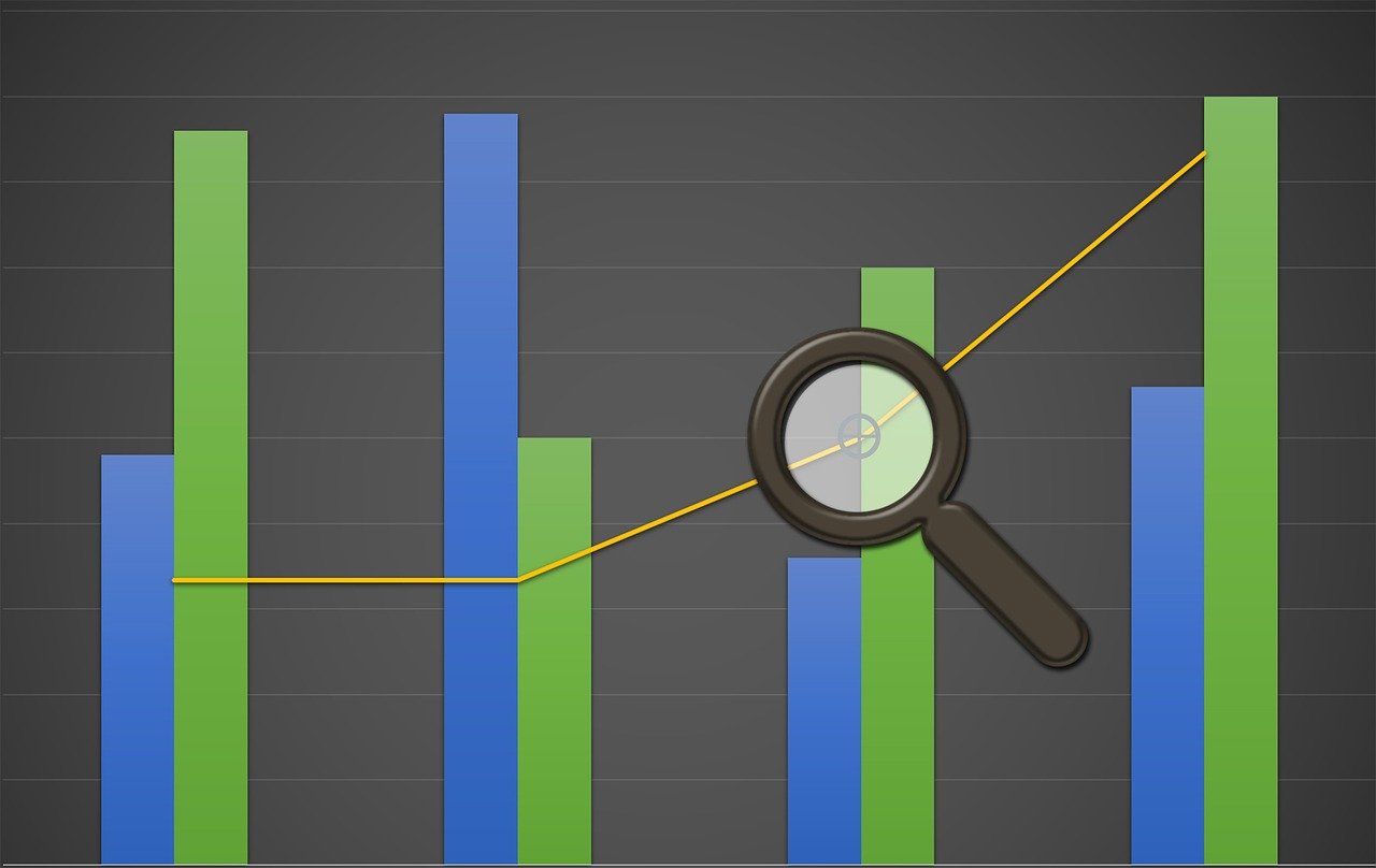
Visualizing Profit and Loss: Techniques and Tips
In today’s business world, effective financial reporting relies heavily on data visualization techniques. Profit and Loss (P&L) statements, when presented visually, can convey complex information succinctly. Various methods enhance clarity while maintaining engagement. Among these methods, charts and graphs, especially pie charts and bar graphs, are immensely popular. These visual formats allow stakeholders to quickly comprehend elements such as revenue, expenses, and net profit. Moreover, they can detect trends and patterns within financial data. Building interactive dashboards utilizing software like Tableau or Power BI can further simplify the analysis process. These tools enable firms to filter and manipulate data for improved insights. Including visuals in presentations enhances stakeholder understanding, ensuring that everyone is aligned with the financial health of the organization. Furthermore, incorporating colors that represent performance thresholds can help in quickly informing viewers about areas that are underperforming. To maximize engagement, always tailor visuals to the audience’s knowledge level; ensure strategic storytelling through data. Ultimately, clear data visualization fosters informed decision-making and drives business success. A well-designed visual presentation can make all the difference in communicating vital financial information effectively.
Starting with the Basics of Visualization
Understanding the basics of data visualization is crucial for translating financial reports effectively. To get started, it is essential to define the key components that need to be communicated. Elements such as revenue streams, cost categories, and profit margins must be highlighted in your visuals. Knowing your audience is fundamental; different stakeholders may require varied levels of detail. For instance, top executives may prefer overviews, while accountants need detailed insights. Using frameworks, like the 5 Ws (Who, What, Where, When, Why), can help create structured visual narratives. Selecting the right type of chart is critical; for instance, line charts are effective for trend analysis, while stacked bar charts can show category comparisons. Accurate data representation, combined with concise labels and legends, ensures clarity. Remember to keep the visuals clutter-free and utilize white space effectively. Consistency in color schemes and formatting across financial reports helps reinforce the message while maintaining professionalism. Finally, consider potential compliance and regulatory requirements when creating visuals for financial statements. Ensuring that all visual elements follow these guidelines not only boosts credibility but also adheres to standards expected by stakeholders and regulatory bodies.
Another important aspect of visualizing financial data is the choice of software tools. Various applications specialize in creating stunning and informative graphics. Investing time in learning these tools can yield dividends in the quality of your presentations. Some popular software programs include Microsoft Excel, Google Sheets, and specialized applications like Tableau, Looker, or QlikView. While Excel remains a staple for many, dedicated visualization tools offer advanced features that can take your data representation to the next level. These tools provide interactive capabilities that allow users to drill down into the data effortlessly. As a result, your audience can explore the financial information that interests them the most. When deciding on which tool to use, consider factors like ease of use, integration with other systems, as well as cost. Moreover, ongoing training for staff will enhance their skills in reporting and analysis. Regular skill updates ensure that the financial team maintains efficiency while adapting to new tools. Ultimately, the right software will significantly optimize your visualization capabilities, leading to improved insights and decision-making processes that align with business objectives.
Best Practices for Presenting Financial Visualizations
Effectively presenting financial data requires adherence to certain best practices. Clarity and simplicity are paramount; viewers must quickly grasp the data without confusion. Starting with a bold headline or title can capture attention and set the context for your visual. It’s also vital to provide supportive context through annotations or tooltips that explain significant data points. Whenever possible, utilize dynamic elements such as animations or interactive features to maintain engagement. Storytelling plays a crucial role in presenting financial data—connect the dots by illustrating how different figures interact. Crafting narratives around key performance indicators (KPIs) can help stakeholders better understand their significance. Additionally, always cite your data sources, especially when sharing internally or externally. Transparency builds trust and credibility. Use legends judiciously to avoid overwhelming the viewer with excessive information. Regularly soliciting feedback from peers or stakeholders about the effectiveness of visuals helps in refining your presentations. Incorporating their insights into future presentations will create a more effective process. Lastly, practice your presentation skills to ensure that you can deliver the visual story confidently and articulately to your audience, leading to meaningful discussions.
As companies increasingly adopt data-driven decision-making approaches, real-time data visualization has emerged as a game-changer. By integrating real-time performance metrics into dashboards, businesses can monitor their financial health continuously. Quick access to this dynamic data allows for faster responses to market changes, enhancing adaptability. Utilizing technologies such as cloud computing can further facilitate this process. Cloud-based solutions allow teams to access dashboards from anywhere, fostering collaboration. Ensuring responsive design in these dashboards can also help mobile users derive insights on the go. Leveraging frameworks like Agile methodology ensures that teams remain responsive to changing business needs. Visualizations that update in real time can minimize delays and improve transparency. By accurately representing fluctuating revenue and costs, organizations can remain proactive rather than reactive. Furthermore, investing in training sessions will enable staff to utilize these tools effectively. Cross-functional teams should collaborate to identify essential metrics that impact various business units. Regularly reviewing which metrics are visualized will ensure relevancy and usefulness. This commitment to real-time visualization will undoubtedly build a culture of transparency and efficiency, greatly benefiting the overall financial reporting process. In the fast-paced business environment, operational agility ensures competitive advantage is maintained through precise financial monitoring.
Engaging Stakeholders through Interactive Visuals
Engaging stakeholders is essential for effectively conveying financial insights. Interactive visualizations empower users to explore data in ways that static presentations do not. When stakeholders have the ability to manipulate and interact with visuals, their understanding becomes deeper and more personal. This engagement fosters discussions around performance metrics, allowing teams to collaboratively analyze data and derive insightful conclusions. Embedding interactive features, like dropdown menus or filter options, offers users the chance to focus on the data most pertinent to them. Collaborate with IT to create dashboards that facilitate these features seamlessly. Ensuring that these visuals are user-friendly will encourage their use during team meetings. Instead of just presenting numbers, let the visuals tell the story, allowing the data to unfold dynamically. You can also incorporate tools that allow stakeholders to provide feedback directly on the visuals, promoting a culture of open communication. A well-designed interactive visual encourages questions and enhances user engagement, making it easier for teams to reach consensus on objectives. As a result, there is a higher probability of aligning financial tactics with broader organizational strategies. In turn, this deeper engagement benefits overall business performance and establishes confidence among stakeholders.
Lastly, continual evaluation and adaptation of your financial visualization techniques is important for sustained effectiveness. The business landscape is ever-changing, and financial needs will evolve as well. Regularly reviewing your visual tools and techniques ensures that they meet the current demands of your stakeholders. Consider implementing quarterly reviews to assess the effectiveness of your financial reports. Gathering input from team members about what works and what doesn’t will help refine your approach. New tools and software emerge continuously, providing opportunities to enhance your visualization processes. Keeping informed about industry trends and innovations enables you to identify advancements that can be integrated into your reporting practices. Further, investing in training and development workshops can aid the financial team in honing their skills, ensuring they remain competitive in utilizing visualization software. This kind of proactive attitude towards adaptation fosters a culture of learning and growth within your organization. At the end of the day, the effectiveness of financial visualizations rests on their ability to provide actionable insights that drive business decisions. By committing to an ongoing evolution of visualization techniques, companies can ensure longevity and success in their financial reporting initiatives.
Conclusion: The Importance of Clear Financial Visualization
In conclusion, clear and effective financial visualization is critical for business success today. By employing diverse techniques and adhering to best practices, organizations can dramatically improve their financial reporting. Well-structured visuals facilitate better decision-making and enhance communication among stakeholders. Emphasizing both clarity and engagement, companies can build trust and promote a data-driven culture. As financial reporting continues to evolve, staying updated with the latest visualization methods and tools will ensure relevance in the marketplace. Tailoring visuals to meet the needs of the audience will elevate stakeholder engagement. Companies should encourage their teams to embrace interactivity in presenting financial data. Interactive reports that allow collaboration and exploration will drive insightful discussions. Additionally, organizations must understand the significance of adaptability, continually evaluating their visual techniques to maintain effectiveness. Investing in training and technological advancements will empower finance teams to excel at reporting. Ultimately, by recognizing the art of visualization, businesses will transform their approach to financial reporting. As a powerful communication tool, visualization can bridge the gap between complex numbers and relatable insights. It is an ongoing journey that will yield lasting benefits in fostering financial clarity and transparency within the organization.