Creating Interactive Dashboards with Excel for Finance Professionals
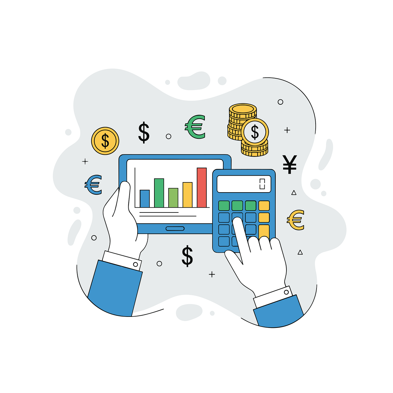
Interactive dashboards in Excel enable finance professionals to visualize complex data effectively, turning numbers into actionable insights. To start, it is essential to gather all relevant datasets, ranging from profit and loss statements to cash flow projections. Organizing data effectively often involves consolidating information from different sources. This organization allows for easy access when building your dashboard. Excel’s functionalities, such as PivotTables, facilitate aggregating data, empowering users to analyze figures dynamically. Leveraging features like slicers can add interactivity, enabling users to filter data seamlessly. Finance professionals might consider utilizing conditional formatting to highlight key metrics, enhancing visual comprehension. Creating a layout that guides the viewer’s eye is paramount for clarity. Use grids or sections for separation, and ensure logical flow is maintained throughout the dashboard. Additionally, it is advisable to use charts appropriately, as they can transform dense data tables into visually digestible formats. When building interactive dashboards, remember to test functionality, ensuring that all links and interactive elements work as intended, which ultimately boosts the dashboard’s usability in financial analysis.
Advanced Excel functions bring powerful capabilities to dashboards, enhancing both performance and user engagement. Functions like VLOOKUP, INDEX, and MATCH are fundamental when pulling together information from multiple data sources. These functions allow finance professionals to cross-reference and merge data seamlessly, ensuring accuracy in reports while saving significant amounts of time. Creating dynamic ranges with the OFFSET function can help generate flexible reports that automatically update as data changes. Moreover, leveraging the power of charts, finance teams can visualize trends effectively. Bar charts and pie charts can swiftly communicate distribution or comparison aspects of financial data. Integrating sparklines within tables allows for quick visual insights without cluttering the worksheet. It’s important to create a consistent color scheme and font style for professional aesthetics. Another vital function is data validation, which ensures data integrity by restricting inputs. Issues like these are commonly faced when dealing with large volumes of financial data. Finance dashboards should also implement user-centric design principles, prioritizing clarity and usability to cater to diverse stakeholders. Ultimately, the choice of advanced functions and design elements greatly determines the dashboard’s effectiveness.
Ensuring Accuracy and Consistency
Accuracy is one of the cornerstones of effective financial dashboards. As finance professionals deal with vast datasets, maintaining accuracy becomes paramount. Regular checks should be integrated into the workflow, ensuring that formulas and functions return correct results. Using Excel’s auditing tools, such as the Trace Dependents and Trace Precedents functionalities, can provide insights into complex formulas, revealing how data is interconnected. Consistency across the dashboard is equally important; therefore, a style guide can be devised to standardize color schemes, fonts, and chart styles. This uniformity helps prevent viewer confusion when interpreting data. Furthermore, investing time in developing custom templates that mimic the layout of your dashboard can streamline future projects. Excel also enables the creation of drop-down lists for key metrics, helping users maintain consistency in inputs while reducing errors. Every finance professional should recognize the necessity of backup procedures; utilizing features like Version Control can mitigate issues stemming from human error. Ultimately, those responsible for creating dashboards must prioritize both accuracy and consistency throughout the development process.
A key feature of interactive dashboards is their ability to present real-time data. Finance professionals benefit significantly from updating dashboards automatically by leveraging Excel’s Power Query. This functionality allows users to connect to various data sources with ease, ensuring data is always current without manual updates. Incorporating dynamic charts alongside this feature will enable stakeholders to quickly visualize ongoing performance and trends. Reporting becomes more intuitive when stakeholders can visualize where variances lie. Moreover, employing macros can automate repetitive tasks, enhancing efficiency when compiling monthly reports. As finance professionals work with figures, incorporating security measures to safeguard sensitive data is vital. Excel offers protection features that restrict editing capabilities, which is essential for maintaining integrity. Additionally, utilizing password protection for files containing confidential information is crucial in today’s data-driven environment. Engaging stakeholders in the development process is recommended to enhance the dashboard’s relevance. Gathering feedback can lead to better insights regarding what metrics are most important for financial decision-making. Ultimately, an interactive dashboard must reflect the organization’s goals and provide valuable insights uniquely tailored to its users.
Utilizing Feedback for Continuous Improvement
Continuous improvement is essential when working with Excel dashboards in finance. Gathering feedback from users enables finance professionals to identify areas needing enhancement. Setting up periodic reviews ensures that the dashboard aligns with changing business needs while remaining relevant and effective. User engagement contributes significantly to this iterative process, as different stakeholders may require distinct insights from the same data. Thus, it is essential to prioritize user-centric design principles while incorporating feedback into future iterations. Consider running surveys or focus groups to identify additional features or improvements users desire, helping align the dashboard with stakeholder expectations. Regular workshops can also be beneficial, as they ensure users feel comfortable navigating the dashboard, leading to a shared understanding of its functionalities. Implementing feedback may result in additional training opportunities that can empower users to engage with dashboards more effectively. Lastly, Excel offers version updates, so staying informed on the latest features is crucial for ongoing enhancements. By continually refining the dashboard, finance teams can ensure that it remains a valuable tool for financial analysis over time.
Communication of insights derived from interactive dashboards is vital for driving informed decision-making. Finance professionals must ensure their dashboards tell a story, guiding users through data. Pivotal metrics should be placed prominently and designed for clarity. Summary sections with highlights and key takeaways can facilitate quicker understanding of complex data interactions. Designing the dashboard with a logical flow helps to convey the financial narrative more effectively. Clearly labeled headings, consistent chart formats, and strategically placed visuals allow users to derive insights effortlessly. Further, utilizing visual cues such as arrows or highlights can denote significant shifts in data, directing attention where necessary. Integrating commentary features or related documents can enrich the insights presented within the dashboard. This added layer of information becomes invaluable for decision-makers who may not have in-depth expertise. Taking the time to explain figures not only fosters understanding but also builds trust in the data. Ultimately, a well-communicated dashboard highlights critical financial insights, empowering stakeholders to make data-driven decisions that align with overall business objectives.
Final Thoughts on Excel Dashboards in Finance
In concluding, interactive dashboards built with advanced Excel functions play an instrumental role in finance. They provide unprecedented insights and facilitate data-driven decision-making amidst the complexities of modern financial environments. Engaging with powerful features and creating user-friendly designs substantially enhances the effectiveness of financial reporting. Consequently, finance professionals should prioritize accuracy, consistency, and communication within their dashboards. By doing so, they increase user adoption and trust in the insights generated. Furthermore, continuous improvement ensures that dashboards evolve alongside business needs. Ultimately, the goal is to create dashboards that not only inform but also inspire action. Harnessing Excel’s capabilities can significantly elevate the standard of financial analysis, allowing teams to respond proactively to market dynamics. Staying abreast of Excel updates and functionalities furthers the potential for innovation in presentation and analysis. As financial landscapes continue to shift, organizations that leverage these interactive dashboards will undoubtedly maintain a competitive edge. Thus, embracing the potential of Excel for building dynamic dashboards can take finance professionals to new heights in their analytical endeavors.
In summary, applying advanced Excel functions to develop interactive dashboards enhances both analysis and reporting in finance. Placing emphasis on user-centric design, continuous improvement, and effective communication of insights amplifies the impact of dashboards significantly. Along with the utilization of real-time data and automation features, finance professionals are empowered to navigate their complex landscapes with ease. Ultimately, a well-structured Excel dashboard facilitates better strategic decisions and fosters an environment of data-driven consensus within organizations that are constantly adapting to changes in the business environment. By embracing these functionalities, finance teams position themselves as strategic partners who drive growth and efficiency across the organization. Therefore, investing time in mastering these advanced Excel functions is not only beneficial for personal development but vital for maintaining organizational competitiveness in an ever-evolving financial landscape. Each of the aforementioned strategies underscores the synergy between finance, technology, and effective data management, highlighting the need for finance professionals to continuously innovate. Embracing change and adapting to new tools and techniques will empower professionals to harness the immense potential that lies within their data.