Designing Interactive Financial Dashboards in Excel
Financial dashboards are essential tools that allow businesses to visualize, analyze, and report their financial data comprehensively. This article aims to provide insights on designing interactive dashboards using Excel. Well-structured dashboards can aid in effective decision-making and performance tracking over time. Interested users can leverage Excel’s powerful features to create dynamic displays of crucial financial metrics. Key steps include defining what information should be presented, determining the target audience, and deciding how to visualize that information effectively. Excel offers various charts and tables that can help present complex data in a simplified manner. The primary goal is to ensure that dashboards are user-friendly, visually appealing, and facilitate easy navigation. You can enhance user experience by incorporating filters and slicers, making data exploration seamless. Additionally, using color-coding and conditional formatting can highlight critical trends and variances. By focusing on the right design elements, you can create dashboards that not only look great but also serve their intended purpose of communicating financial insights succinctly and accurately.
A crucial aspect of building dynamic financial dashboards in Excel is planning and design. A well-planned dashboard can significantly improve data presentation and user engagement. This stage involves identifying the key performance indicators (KPIs) you want to highlight for stakeholders. KPIs should be specific, measurable, and relevant to business objectives. Once established, you can gather the necessary data needed for the dashboard’s accurate representation. Using the right data source is critical, as accurate input leads to actionable insights. In Excel, you can connect to various data sources such as databases, spreadsheets, and even online services. Organizing data into tables or ranges enhances clarity and ease during the dashboard development phase. Furthermore, it’s important to think about how users will interact with your dashboard. Incorporating dropdowns and button controls can facilitate better user experiences by allowing customization. Once your data is in place, you can start working on the actual layout and design of your dashboard. Choosing the right charts and graphs will help to effectively showcase the financial data, leading to informed decisions.
Chart Selection and Visualization Techniques
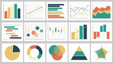
Selecting the appropriate charts and visuals for your financial dashboard is vital to convey information effectively. Different types of data will dictate which visualization techniques are most suitable. For example, line charts are excellent for tracking changes over time, while bar charts effectively compare quantities across different categories. Pie charts can also play a role in showing proportionate relationships in your data, although they’re best used sparingly. A combination of visuals may help users gain deeper insights into financial performance. Additionally, advanced visualization options such as sparklines and waterfall charts can add more context to your data. Excel allows for various formatting options, making it easy to manipulate colors, labels, and legends to enhance your visual representations. Remember to avoid cluttering visuals with excessive information, as this can lead to confusion. Use titles and captions to clarify what each visualization depicts, which aids stakeholders in grasping the essential points quickly. By adopting these visualization techniques, you can create impactful and interactive dashboards that resonate with users and stakeholders alike.
Another critical consideration in building dynamic dashboards is dashboard interactivity. Interactivity adds a layer of depth that allows users to explore the data according to their needs. Excel provides functionalities such as filters, slicers, and pivot tables that significantly enhance the interactive elements of your dashboard. Filters enable users to narrow down data views based on specific criteria, making the dashboard more user-friendly. Slicers provide a visual interface that simplifies filtering, thus improving user engagement. Implementing pivot tables alongside your dashboard can facilitate a deeper dive into your financial data by allowing users to rearrange and summarize information interactivity. This functionality is essential for financial analysis, as stakeholders can extract insights relevant to their specific inquiries. Additionally, using macros can automate repetitive tasks and enhance user interaction by simplifying complex calculations or data updates. By focusing on these dynamic features, you can offer a more engaging experience for your dashboard users, allowing them to derive meaningful insights from the data you provide.
Data Accuracy and Maintenance
Data accuracy is imperative when building financial dashboards, as decisions are often made based on the information presented. Ensuring the accuracy of your data should be a top priority throughout the dashboard creation process. Start by establishing robust data validation rules in Excel to minimize the likelihood of incorrect data entry. Regularly review data for inconsistencies or errors, especially if the dashboard is tied to external data sources. Setting up automated checks can help streamline this process. It is also essential to periodically update the dashboard to reflect new data or changes in business processes. Establishing a maintenance schedule ensures that the information remains current and relevant. Engage with stakeholders to receive feedback on the dashboard’s performance and data usefulness; this can lead to necessary adjustments or enhancements. Regular maintenance also includes revising visualizations and KPIs as business needs evolve. By committing to data accuracy and systematic maintenance, your financial dashboard will remain a dependable tool for stakeholders seeking insights and decision-making power.
Lastly, user training and support are crucial elements in deploying your financial dashboard successfully. Even the most beautifully designed dashboards are ineffective if users do not know how to utilize them. Organizing training sessions or creating user guides can facilitate smoother adoption of the dashboard among stakeholders. Training materials should cover basic navigation, interactivity features, and interpretations of the visuals. Utilizing hands-on examples during training will better equip users in understanding how to leverage the dashboard for their unique needs. Continuous support is vital – offer channels through which users can ask questions or report issues. Building a community around the dashboard can also foster collaboration and shared insights among users. Consider implementing user feedback mechanisms to encourage input on potential improvements or enhancements regarding usability and functionality. Remember, a dashboard is only as powerful as the skills and knowledge of the people using it, so prioritize user education to maximize the benefits of your interactive financial dashboard.
Conclusion
In conclusion, effective financial dashboards in Excel can dramatically enhance decision-making processes for stakeholders. As we discussed, it involves several critical aspects: design, data accuracy, interactivity, and user training. By carefully planning your dashboard layout and selecting appropriate visualizations, you can create a compelling narrative around the financial data you present. Interactivity not only makes dashboards more engaging but also allows for personalized data exploration. Equally, maintaining data integrity and providing user support will ensure the dashboard continues to deliver actionable insights over time. The construction of a financial dashboard should not be viewed as a one-time event; it is vital to seek continual improvement based on user feedback and changing business needs. Developing an intuitive dashboard using these principles leads to increased user satisfaction and better business outcomes. The journey to creating effective financial dashboards is ongoing, and dedication to the process will ultimately pay off in terms of better-informed decisions and enhanced business performance. Embrace these strategies to leverage Excel for comprehensive financial modeling and dashboard development.