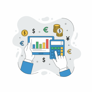
Creating Dashboards that Tell the Story of Your Nonprofit’s Finances
Creating effective financial dashboards for nonprofits requires a structured approach. A dashboard serves as a visual representation of your organization’s financial health, allowing stakeholders to grasp critical information at a glance. First, understanding your audience is paramount; consider who will use the dashboard and what insights they need most. Concentrate on the key performance indicators (KPIs) that reflect your nonprofit’s mission and operational goals. An engaging dashboard should employ a clean layout, intuitive navigation, and relevant visuals. Utilizing graph types such as bar charts, pie charts, and line graphs can enhance comprehension. Software options such as Tableau or Google Data Studio can streamline the design process, making it efficient. It’s essential to incorporate real-time data feeds, ensuring that your dashboard remains updated and relevant. Regularly reviewing the dashboard for accuracy and effectiveness is critical; it should evolve alongside your nonprofit’s needs. Moreover, involving stakeholders in the design process can result in a more tailored dashboard that better meets their requirements. Utilize this tool to drive impactful discussions about your organization’s financial future.
Identifying the right KPIs for your nonprofit is a crucial element when creating financial dashboards. KPIs provide quantifiable metrics that reflect the organization’s success in specific areas. Start by aligning these indicators with your nonprofit’s strategic objectives. Common KPIs include total revenue, expenses, fundraising efficiency, and net assets. Visualizing these metrics within your dashboard can help board members and stakeholders understand the financial direction quickly. It’s advisable to use color coding; for instance, green could indicate positive growth, while red may flag potential issues. Regularly updating KPIs ensures that your dashboard remains relevant, providing critical insights for decision-making. Additionally, consider incorporating comparative figures, such as previous year performance or budget forecasts, to highlight trends. Furthermore, segmenting data by programs or departments can provide a more granular view of financial performance. Establishing a framework for collecting data consistently is also essential. Utilizing accounting software integrations can streamline this process, ensuring accurate data capture. Ultimately, the right KPIs, visualized effectively, can empower your nonprofit team and board to make informed financial decisions that align with your mission.
Essential Components of Financial Dashboards
A well-designed financial dashboard encompasses several essential components that enhance its utility. First, the overview section is critical, offering a snapshot of the organization’s overall financial health at any given time. Following this, detailed sections on income sources, expenses, and budget variances are vital for comprehensive analysis. Each section should utilize visual tools effectively; for example, bar graphs can display income trends over multiple periods, while pie charts can represent the ratio of expenses across various programs. Additionally, including narrative summaries can provide context to the numbers; this helps stakeholders understand potential implications. Interactive dashboards can also provide users the flexibility to explore different time frames or specific data points. Incorporate filters that allow users to dive deeper into the numbers according to their interests. Another important element is the forecast capability, which can help stakeholders anticipate future challenges or opportunities based on historical data. By including these components, your dashboard can become a robust tool for analysis, decision-making, and strategic planning, leading to better financial management practices in your organization.
Leveraging technology is indispensable when creating sophisticated and insightful financial dashboards for nonprofits. Selecting the right software can make a significant difference in both ease of use and data integration capabilities. Popular tools such as Microsoft Power BI, Tableau, and Qlik Sense offer excellent functionalities for data visualization and reporting. A significant advantage of these tools is their ability to connect with various data sources, including accounting software and CRM systems, thus allowing for easy extraction and representation of data. Consider employing cloud-based solutions for accessibility; stakeholders can access the dashboard from anywhere, promoting timely decision-making and collaboration. Training team members on how to use these tools correctly enhances dashboard efficacy. Regularly updating software can also help maintain security and functionality. Furthermore, utilizing mobile dashboards can provide quick access to financial insights on the go. These innovative approaches ensure that your financial dashboard remains relevant, interactive, and engaging. By harnessing current technology, your nonprofit can effectively communicate financial stories, showcase transparency, and foster trust with stakeholders and community members.
Storytelling Through Data Visualization
Data visualization is an essential skill when creating dashboards, particularly in the nonprofit sector. These visual tools can transform complex financial data into compelling stories that resonate with stakeholders. By using various chart types, such as line graphs to illustrate trends over time or heat maps to indicate areas of concern, your financial data can convey information more powerfully. When designing these visual elements, consider the narrative structure: what message do you want to deliver? Consider utilizing annotations or highlighted sections to draw attention to key insights, ensuring important information does not go unnoticed. Implementing interactive dashboards allows users to explore data in greater detail, further enhancing engagement. Always be mindful of color choices; using a coherent color scheme can reinforce the overall message and make the dashboard aesthetically pleasing. Moreover, thoughtful layout organization is key; a well-structured flow can guide viewers from one data point to another effortlessly. Ultimately, storytelling through data visualization can enhance understanding, drive conversations, and lead to informed decision-making, significantly impacting your nonprofit’s financial strategies.
Achieving stakeholder buy-in for your financial dashboard is crucial for its successful adoption and utility. Engaging stakeholders early in the design process can instigate a sense of ownership and ensure that the dashboard meets their informative needs. Hosting regular feedback sessions during the development phase allows you to gather input and refine your design. It’s beneficial to demonstrate the dashboard’s capabilities through pilot tests with key users. Show them how the dashboard simplifies complex financial data, providing clarity and actionable insights. Highlight potential use cases tailored to specific departments or programs, illustrating how stakeholders can derive value from the dashboard. Additionally, offering training sessions can empower users and enhance their comfort level with the new tool. Ensure that there are clear instructions and ongoing support for queries that may arise. By fostering a culture of inclusivity and emphasizing usability, you can create a positive reception for your dashboard initiative. Furthermore, promote success stories that showcase the dashboard’s impact on decision-making, reinforcing the importance of this financial tool across your nonprofit organization.
Continuous Improvement and Future Innovations
Continuous improvement is foundational to maintaining the effectiveness of your nonprofit’s financial dashboard. Regularly revisiting the dashboard’s content and visualization techniques can reveal areas needing enhancement or updating. Gather user feedback through surveys or direct discussions to identify what features are working well and which need improvement. Keeping abreast of new trends in data visualization and dashboard technology can provide innovative ideas for future enhancements. As the financial landscape evolves, so should your dashboard’s metrics and features; this adaptability ensures relevance over time. Regular updates also promote transparency, reassuring stakeholders that the organization is proactive in managing its financial health. Consider establishing a routine for reviewing the dashboard quarterly or biannually. This schedule allows periodic reassessment of its performance metrics and visual tools. Moreover, examine case studies from leading nonprofits that effectively utilize dashboards; learn from their methods and challenges. The goal should be to foster a culture of continuous learning and improvement, ensuring your organization is not just reactive but proactive in fiscal management, empowering it to thrive amidst changing circumstances.
In conclusion, creating financial dashboards for nonprofits is both an art and a science. It combines analytical skills with a talent for storytelling. Your dashboard should not only present data but also illuminate the financial narrative of your organization. Focus on building compelling visuals and ensuring your KPIs align with your nonprofit’s mission and goals. Engage your stakeholders right from the beginning, and be prepared to iterate based on their feedback. A dynamic and responsive dashboard can significantly enhance financial oversight and drive data-led conversations. Technology should serve as an enabler, allowing intuitive access to critical insights anytime, anywhere. Remember the importance of continuous improvement; financial landscapes change and so should your tools. Building a culture of transparent reporting fosters trust among stakeholders. By leveraging the right technology and data visualization tools, your nonprofit can tell its financial story effectively, demonstrating progress and impact. Whether you’re monitoring fundraising efforts, tracking expenses, or planning budgets, a well-crafted financial dashboard can be transformative. Ultimately, the goal is to empower your nonprofit to make confident and informed decisions, ensuring sustainability and impact in your community.